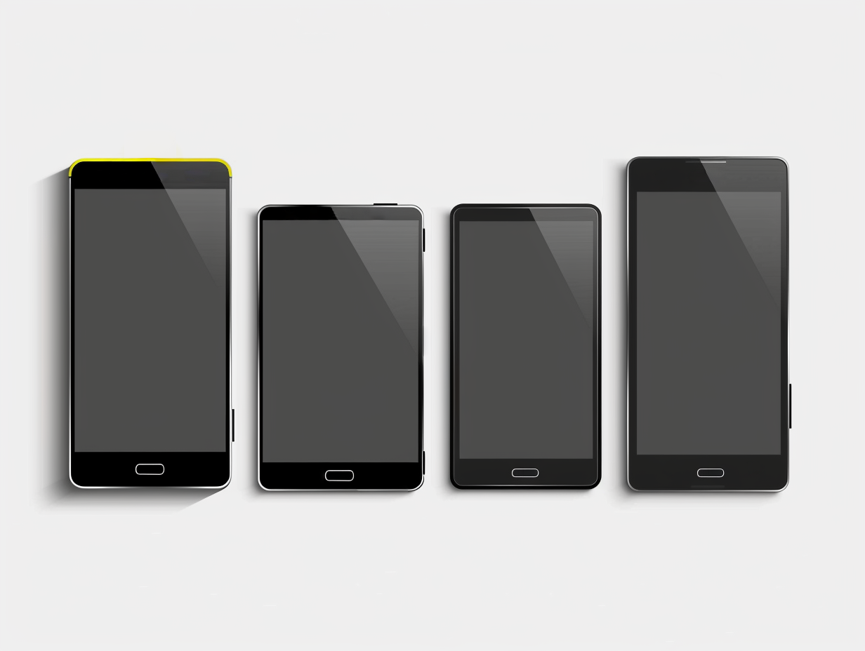
A Complete Guide to Android Screen Resolutions and Sizes
Crafting a visually stunning and functional app requires an in-depth understanding of Android screen resolutions and sizes. With the ever-expanding array of Android devices boasting different screen dimensions, it’s essential to ensure your app delivers a seamless experience across all phones. Fear not, developer heroes! This comprehensive guide will arm you with the knowledge needed to conquer the diversity of Android screens.
Exploring Screen Size vs. Resolution Clarity
First off, let’s debunk a common misconception. Screen size refers to the physical dimensions of a device’s display, measured diagonally in inches. On the flip side, resolution pertains to the number of pixels packed into that screen space. The more pixels, the sharper and crisper the visuals.
Navigating the Dynamic Android Screen Landscape
One of Android’s strengths lies in its diversity. Manufacturers have the liberty to produce devices in a myriad of shapes and sizes, presenting a unique challenge for app designers. Here’s a snapshot of the current Android screen spectrum:
Screen Size Range: From compact 3-inch diagonals to expansive 6-inch-plus displays found on tablets and foldable phones.
Resolution Variety: The gamut spans from lower resolutions reminiscent of early smartphones to ultra-high-definition resolutions seen on flagship devices. Common resolutions include HD (720p), Full HD (1080p), Quad HD (1440p), and beyond.
Pro Tip: Keep abreast of updates! The Android screen landscape is ever-evolving with new sizes and resolutions surfacing regularly.
Designing for the Masses: Responsive Layouts and Resources
So, how do you design an app that looks great on a tiny phone and a giant tablet? Here are your weapons of choice:
Responsive Layouts: Build your app's layout to adapt and resize its elements based on the available screen space. This ensures a seamless user experience across different devices.
Alternative Layouts: For more complex scenarios, create alternative layouts specifically designed for various screen sizes and resolutions.
Bonus Tip: Utilize Android's handy resource qualifiers to provide different app assets (like images) optimized for different screen densities.
By understanding screen sizes, resolutions, and employing responsive design techniques, you can create an app that looks polished and functions flawlessly on any Android device. And with the help of free stock photo websites like OnFreeStock.com, Freepik, Pexels, and Unsplash, you can add that extra bit of visual magic to make your app truly stand out!